
ORC 2024 Spring | Week 6
- Amandork

- Apr 20, 2024
- 4 min read
Updated: May 9, 2024
Hey there, my fellow design DIVAS! It's your girl Amandork from Foster Decor, and I'm back with another wild ride through the One Room Challenge (ORC).
If you thought last week's paint selection saga was a rollercoaster, just wait until you hear about the chaos that's been going down in my kitchen. 🔥
Ditching the Vanilla and Embracing Color

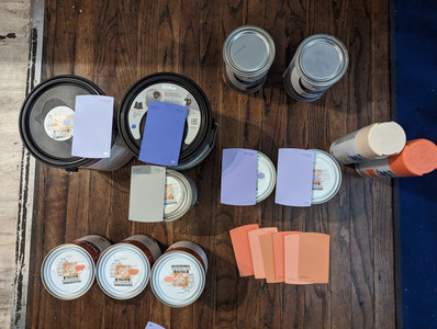
Last week, I left off with picking out a TON of paint colors, and let me tell you, I was on a mission to ditch that boring, greige look once and for all. As I mentioned, it's week 6 of the ORC, and it's been a HELL of a ride so far.🌸
We left off last week with picking the paint selections, and boy did I come home with a TON. But back to Home Depot I went to purchase ALL the colors (probably way too many). I'm tired of doing upgrades for resell value. What is that? Why are we prepping our home that we live in now, for the future? So, it's time to DITCH the vanilla as I say and get some color.💜
Painting Prep and Panic


First up, I NEEDED to sand down the lower cabinets as they already had a coat of grey paint I did last year. I wanted to update that horrible 80's orange color with a clean grey, but then I had a change of heart. I'm saying the HECK with it and getting some color on these bland greige cabinets.🔨🧰


The home depot guy was REALLY cool and patient with all my orders. I needed coral tones for the stripes in differing hues, and I also needed Wild Pansy BLUE for the cabinets and a periwinkle color for the walls.


This seemed like a great idea, and I had all my tools and paint colors good to go, so back home to prep.🥰
Countertop Transformation


While I was at it, I decided to take Stephanie's advice and give the countertops a FACELIFT with some Rustoleum paint in a lovely Light Ash shade. Goodbye, ugly laminate, hello, clean and neutral surface that's gonna tie this whole thing together.🦄


The difference between the ugly, busy, and muddy-looking laminate and the new, clean countertop coat is just wow.


A little (okay, a lot) of paint can make such a difference in brightening up a space and DECLUTTERING things visually.🚀
Blind Ambition


And let's not forget about those blinds. Stephanie recommended going for a chrome look, and I'm talking straight out of an 80s bachelor pad.
Sure, I could have splurged on the fancy new ones from Wayfair, but where's the fun in that? Nope, I busted out the Rustoleum metallic paint and got to work. DIY all the way, BABY!
Ceiling Shenanigans


But the real SHOWSTOPPER? The ceiling, of course! I'm all about drawing the eye up, up, up, and this Wild Pansy blue paint is doing just that. It's like a little piece of the sky has descended into my kitchen, and I'm here for it.🤯


I felt like I taped, taped, taped all the blue painter's tape in the whole city in my kitchen, but this is SO crucial to a smooth design. I'm not the most patient person, but I make sure to line up the tape and cover the hardware, walls, and floor to make sure I have less of a mess for later because it gets dirty.


I'm CLUMSY and SPILL- hey, mistakes happen, so this is my way of helping future Amanda have less headaches.👀
Mermaid Mayhem


Just when I thought I had it all figured out, DISASTER struck. As I was admiring my handiwork, I suddenly realized that my kitchen was giving off some serious Little Mermaid vibes. 😫
Ariel, is that you? Nope, nope, nope - not the vibe I was going for. The periwinkle color was looking more lavender than expected, and the Wild Pansy blue on the cabinets was just a tad too...well, blue. Time to hit the RESET button and start over.🤣
A New Direction


So, with the help of Stephanie's expert advice, I decided to switch things up. I tested the Wild Pansy blue, and WOAH, was it...blue. I felt like with the walls a bit MORE lavender than expected, it was going to look like a blueberry exploded in my kitchen.✨


So, off to Home Depot AGAIN to get the Esmeralda paint. This seemed like a cool-toned hue that would complement the periwinkle and work with the bold blue.
🎁 I'm crossing my fingers that this color combo is going to be the showstopper I've been dreaming of. And you better believe I'm not stopping there - I've got some more tricks up my sleeve to really make this kitchen POP.🌟


So, stay tuned, my DESIGN DIVAS, because next week's transformation is going to be a doozy. I'm talking bold, I'm talking edgy, and I'm definitely not holding back. This kitchen is about to become the stuff of legends. Buckle up, because the journey continues!🌿
Make sure to check out my Instagram to follow along with ALL the behind the scenes fun!
CTA
Are you an interior designer / eDesigner struggling to land clients + projects?
Do you need to refresh your branding so that it works FOR you and attracts the clients you LOVE working with?
Do you feel stuck in your business + need an eDesign EXPERT to help TRANSFORM ‘hobby’ into a thriving eDesigning biz you love?


Comments